Thanks to your excellent comments, I’ve modified my poster designs. Now which do you like best?
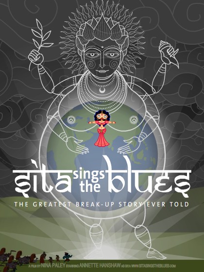
Poster A.2

Poster B.2
Which is best? Inquiring graphic designers want to know. Thanks for your help!

Animator. Director. Artist. Scapegoat.
Thanks to your excellent comments, I’ve modified my poster designs. Now which do you like best?
Poster A.2
Poster B.2
Which is best? Inquiring graphic designers want to know. Thanks for your help!
I like A the best.
Definitely the latter!
Poster A! It has boobs.
B!
A. The background is subtle and the text shows up really well. But both are amazing pieces of work. Awesome stuff.
Right now I’m leaning towards B:
How’s my reasoning? My main goal is getting Berliner butts in seats.
I lean toward B myself, but not by that much.
I’d be happy with A too.
Overall, I like the distinctive quality of silhouette effect for Sita.
I like B.
Sound reasoning – though I am not too convinced ‘Berliner butts’ will know about Agni Pariksha _before_ seeing the film. Pregnant with the world catches the attention in A and it’s something everybody understands – Totally agree on the scary part in B though 🙂
True enough; people are unlikely to know the symbolism in either poster. Poster A shows the climax of the film, where Sita returns to the womb of Mother Earth. I’m concerned with how the poster will affect the viewing of the movie: is it disappointing to have already seen the climax in the poster? Poster B will probably evoke ideas about “Hell” and “Satan,” then viewers can be surprised by the alternate meaning of fire and Agni in the film. Since the tagline is “The Greatest Break-Up Story Ever Told,” fire/Hell is still appropriate.
Still haven’t made up my mind.
I still like A the best.
🙂
I still prefer B in these newer versions.
I think moving the tag line in version B up has helped avoid visual clutter in some of the more interesting areas of the illustration.
There asymmetrical elements in version A haven’t been pushed far enough to be as strong as the more symmetrical B. I think B has been stronger all along, with just the right amount of asymmetrical elements in the design to keep it quite active. Sita doesn’t seem so much like a simple icon in this one, but more as a central character. Perhaps its the subtle separation from the title with color.
Tough decision!! I like Poster A so much, sooo much. But I agree with your reasoning: It prematurely shows the climax. So my vote goes to Poster B!
Personally, I prefer A, but I think B.2 will actually bring in more of the general movie going public in America for 2 reasons, both nipply.
I think you should use B.2 as the American Poster and A.2 as the International poster.
Or to look at it another way, I think B.2 is a better advertisement, but A.2 is a piece of Art I would rather own.
Hope that helps!
I’d say B.
B, definitely
I’d agree that A.2 is the better work of art, overall, though to my eye Sita stands out a little too much against the overall color scheme, and her location in the exact center feels wrong, somehow. B.2 is much more eye-catching, however, and is likely to draw people in, I’d guess. Hadn’t thought of the infernal overtones of B.2, but now that you mention it, Agni looks pretty satanic in that particular setting.
I’m going to vote again (who’s counting!).
Image-A : Good for a DVD cover, pamphlet, handout etc. (close viewing, hence excess details matter and are appreciated)
Image-B : Good for a poster (for viewing from afar, colors attract, largely readable)
Based strongly on the consideration that there is a difference between the viewing distance on a computer screen and a large poster.
Image-B attracts (reddish/warm hues). I personally dont like the hindi-english font because it makes reading difficult, but thats a personal preference (Just watched a movie called “Helvetica” about typography, so I’m temporarily biased).
Oh, and I just realized that I’m also biased against the font because I know hindi, and my mind automatically tries to read the first letter as “ee” instead of “S”.
How many berliners know hindi ? Probably not many, so the font might not jarr their brain.
I like B. Love the interplay between three beards. Got to throw in old art school mantra of poster being a two-second medium. Devnagarised font is a bit much.
I love A, but B seems like a more typical movie poster. If forced to chose, I would go with A.
Beautiful work either way.
B is my choice – the simple color scheme and striking, but straightforward, design catch the eye. Once attention is caught, there is more perceiving, and the questions “is that three people or just one? Is she…is she dancing?” draw the mind in. It’s fascinating, a mandala in its own way. The “A” poster is gorgeous, but too complicated & busy to draw attention after a quick glance, and the naked earth is perfect for the symbolism but some prudish know-nothings would surely object (idiots).
I still like A.
Definitely #2
ohhh I’m so excited for you! Congrats
My choice is A. The reasons are: 1) Sita was a strong female figure who in the end got feed up of the unfair treatment she got from Ram et. al. She no-doubt forgave them because true lovers forgive, but hindu literature does not portray this, they do not emphasis enough the Rama in the end realized his folly. Therefore the poster A depicts the fact that she is above the non sense that Rama et.al. did, and they are the one running to say “I am sorry”.
2) Boob
I like the second one, although both are nice.