Which 24-frame cycle do you like more:
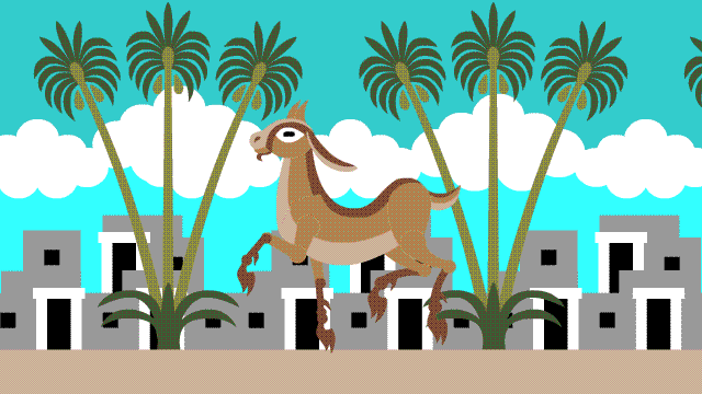
Cycle A, “Clouds”, or…
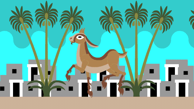
Cycle B, “Waves”?
I personally prefer Cycle B, because I like backgrounds where everything is moving – I feel it gives it more depth. As a 2-D design the clouds look nice, but in an animated cycle their stillness bothers me. I did make a version with moving clouds, but on this 24-frame cycle they had to be very dense to repeat:
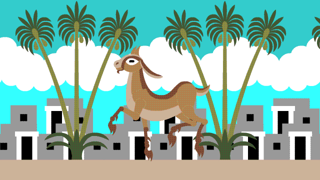
Cycle C, “Repeating Clouds”. I still prefer Cycle B. The sky pattern might be a bit unconventional, but I think it’s stylish. Also I don’t like all that white in the background of A and C.
The palette is limited to 10 colors because this is destined for Embroidermation. The animated GIF doesn’t have great color fidelity; thread colors will look better and have more contrast between foreground and background.
If you have an opinion on which of these you prefer, please leave it in the comments and maybe it will help Theo and me settle our argument.

Cycle A, “Cloudsâ€
🙂
C. The white is necessary to read the deer.
I prefer B “Waves”. The White clouds are standing out due to their high contrast, uncomfortably forcing eye to get distracted away from the animal.
Ooh, looks great! I prefer A. The moving clouds of C. throw off my orientation, and B. Is somewhat flattening, to my eye. With A. the goat pops forward, and there’s a greater sense of depth and different planes. With B., the value of the two background teal colors is too close to the goat, pulling him back, because your eye is trying to connect the goat colors to the sky. Maybe the goat could be a notch brighter in B., or the background a stairstep lighter to counteract this?
I definitely prefer #2 to #1. The third is close to number 2 in preference. The clouds seem more conventional, but the undulating wave seems easier on the eye.
I’m not an artist, and you’ve done great things without my opinion before, but you asked. 🙂 I prefer A, but am not against B. Because everything is moving in B, it seems to be going much faster (too fast?) – maybe you want that? And C, i agree, is too “wooly”, and not “cloudy” enough. But in the end, B is not bad, so either will be fine.
Thank you for all your great work. (I’m an activist with WILPF, among other groups, and have appreciated the free graphics you’ve provided over the years, in the cause of Justice.)
C, because you really need the white in the background to make the goat “pop.”
I like B. The whiteness of the clouds is really distracting to me. Maybe you could put one tiny cloud in?
Much prefer “B”. White cloud group was drawing too much attention to the BG. LOVE this project, BTW..
Point 1: I was very confused about B. Because of the angle of my monitor, I was getting no difference in the colors. Leaned in to look closer, and that changed the angle enough to discover the waves. (I don’t care for them. Not very sky-like)
Point 2: I feel the clouds are moving too quickly in C. And oddly clumped. Ideally, I think those 24 frames would stretch over the whole verse.
So overall I’d choose A.
Prefer: B, then C
I liked A until I realized the clouds seem to be keeping up with the the leaping critter. So I would go with B or C.
B or C because the background should be fully parallaxing. I think you should choose the background based on the mood of the scene and how you want the colors perceived. The colors in B are fine but give the entire scene a darker feel. The clouds in C give the scene a much brighter feel but also make the skyline look natural and gradient even though it is not. As mentioned above, the clouds make the goat pop out more which is the focal point of the scene. I would choose C just barely over B but either looks good.
I think B – the brightness of the white draws attention away from the leaping critter.
I like cycle B, and I saw them as mountains before I read that they were waves.
Couldn’t you just animate the clouds on A like the waves on B?
I like A best because the clouds in C seem too busy and B seems too plain. B also looks… rainy? Not very desert-like.
Clouds A
I like C better than B. The sky should be moving so not A.
I prefer the first one.
C. I disagree that the white clouds are distracting, and agree the background should be moving to add the illusion of depth.
One useless opinion that can’t consider the style & feel of the complete artwork:
I like A. C is busy with everything but the floor moving (but it seems to). Having lived near mountains, I interpret B as mountains. Fast B & C skies make gadya run very quickly, and can’t be slower in 24 frames. Background A seems more realistic and dimensional. But, follow your muse.
Hello Nina.
I think that in both 1 and 3, the resultant contrast is excessive such that the white cloud unecessarily dominates the scene and becomes the main focus instead of the loping animal. The movement of the cloud or not is thus of no consequence.
2 strikes the right image Contrast balance and Viewer attention Focus thus returns to the loping animal. Moving the symbolic cloud also maintains action balance so it too does not attract particular attention at the expense of the main feature which is the loping animal.
Hope this opinion helps.
Cheers. John (79+ yrs young. Retired Pro. Photographer)
Cicle B
Wow–what a lot of opinions. The more I look carefully at all three the less I have a preference. I see value in each of them…I just ADORE that goat.
i like the clouds, but they form too solid a band. What about some spacing between clouds? or would all those transitions be too busy? A, I guess.
I looked at it yesterday and let it sink in. I would vote for B, with C as second choice. It is strange, distant clouds do not visually move (A), but it detracts from the dynamic sense that I like in B and C. After letting it simmer, I like the relative visual simplicity of B. The clouds are less abstract, but there is enough going on in B for me to find the cloud-forms visually distracting from the other richnesses of the image. Just my take.
Now that I have written this, and read the other comments. I love their thoughtfulness and insights.
As a personal preference I would go with A. But it’s mostly because the contrast in B seems a little low. I do like the pacing of the B animation the best. Since you mentioned that the colors will have more contrast in the end product, I could imagine that my personal preference would shift over to B.
B
A: clouds not moving but buildings moving seems odd. If the clouds were shaped more like snow-covered mountains, it would make more sense visually to have them static.
B: wavy sky seems not sky-like – more sea-like, especially with the colors tending toward green. If the curve was sharper to look like mountains, it would make more sense visually.
C: Too much movement (different rates of movement) takes away from the leaping animal.
I suggest either making the clouds not go from end-to-end (have spaces between) or (if appropriate to the location) make them snow on mountain peaks (thinner altogether, sharper angle, etc.) and not moving.
My two cents (I went to college with Josh) and I can’t wait to see the final result. Sita was amazing and I showed it to lots of people.
I like “C” the best – the waves are too abstract for me.
C
A & C. I like the clouds in A, but I like the way they move in C.
A. Clouds. Clouds tend to stay still in the background when everything closer appears to be moving I like A.
I prefer B. The background is more stylish and less intrusive. Smooth and well-working solution.
A or B. C is too much white.
I prefer A colors and C motion.
I prefer B. The waves to me symbolises the passing (wave) of time, and give significance to the scene. Like how the time flows like water, and the focus on the goat seems like it represents something important (depending on how you’re going to implement it). It could be useful in the future to convey a message (if any).
Otherwise, my second choice would be a mix of A and C. Preferably A in motion (not standstill).
I prefer clouds, A being my first choice. Depending on where the eye focuses, the tree moving past the clouds is more pleasant for my eyes and one can almost see the clouds moving past the trees.
Given that they all make you a bit dizzy after watching them a while, I like C with the dense clouds. Your explanation about the movement of the background made sense, and the addition of the clouds adds depth.
Don’t know if you guys already reached a decision, but I prefer cycle B. A is too static as you mentioned, and in C I actually think the clouds moving is a bit distracting, in part because the shape of the clouds and their whiteness split the darker and lighter green of the sky in the background, which end up making it really busy (it actually looks like the bottom of the clouds are moving at a different rate from the top).
Cycle B may not be as “realistic”, but in terms of design and overall smoothness of the simple background doesn’t detract from the actual detail. Definitely design and clarity over trying to make a distracting element fit.
I prefer A, it reads the best to me. Makes the goat stand out more.