I’m dazzled by too much brilliance today. First, there’s Graham Rawle’s masterpiece Woman’s World.
 It is so good. The whole thing is “written” in collaged snippets of old British women’s magazines. On top of that, the story is moving, suspenseful, and engaging from start to finish, as well as funny, deep and clever. For something that could stand on its own for being technically singular and “meta,” it packs an enormous emotional wallop.
It’s a sad comment on society that this book isn’t more widely famous. Still, I’m grateful just to have read it.
Rawle also has a blog where you can see his latest creations, including the weekly “Bright Ideas“.
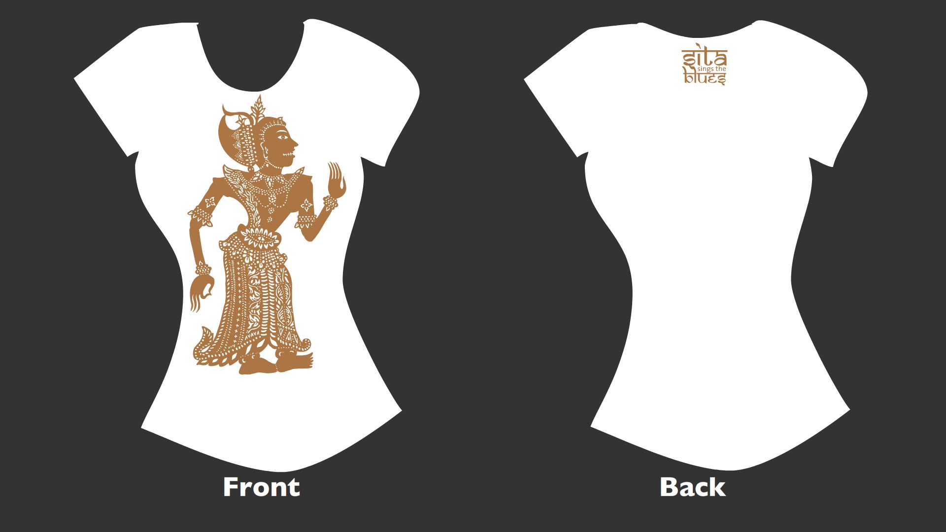
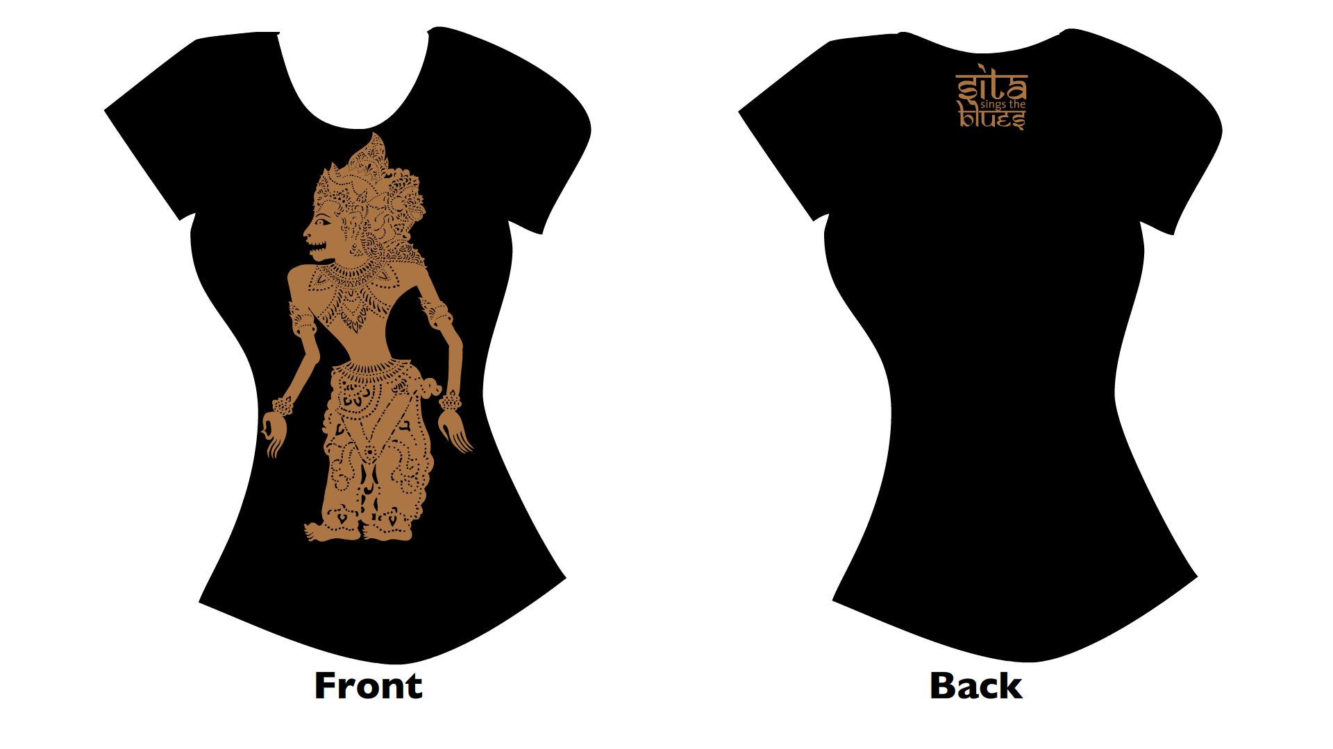
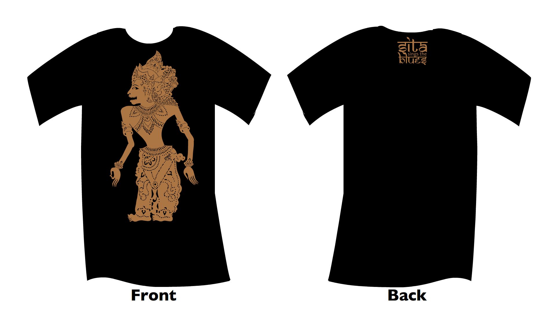
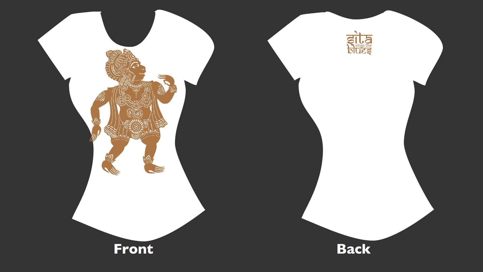
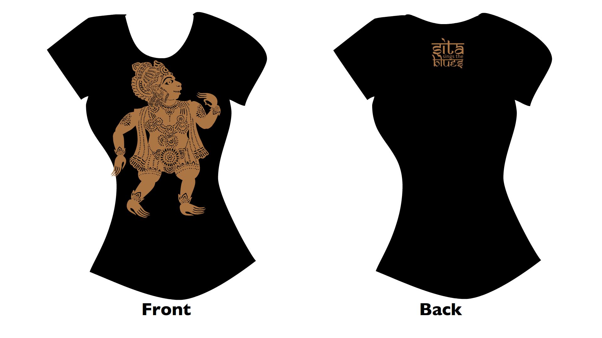
 No sooner had I finished Woman’s World than I started Sanjay Patel‘s breathtakingly beautiful Ramayana: Divine Loophole. Sanjay and I joined the same Mutual Admiration Society a few years ago, before Sita was even finished. We independently developed graphic 2-D stylings of the Ramayana; his are more intricate and angular, while mine are more rounded and outlined. There’s been a wee bit of confusion among friends and Sita fans which I’d like to put to rest: I love this book, it’s not “edging in” on Sita’s “territory,” and y’all should admire a copy for yourselves. Besides, there is no Sita print book available, and if there were it wouldn’t be this good.
Its publisher, Chronicle Books, has conventionally stingy ideas about sharing images online; Michael Sporn had to scan his review copy himself. Fortunately, Sanjay has more images on his web site. Even if every image were available digitally, they wouldn’t compete with the physical beauty of the printed object. The production values of this thing are extraordinary. You want to touch it and smell it. Every page is printed crisply and perfectly, with color bleeding off each knife-sharp edge. It’s everything a graphic book should be, offering a sensual, immersive experience. Like one reviewer wrote, “I want to physically jump into this book.” It’s a container worthy of its content, restricted or not.