UPDATE: newer poster designs above
Please help me choose a poster design to take to Berlin:
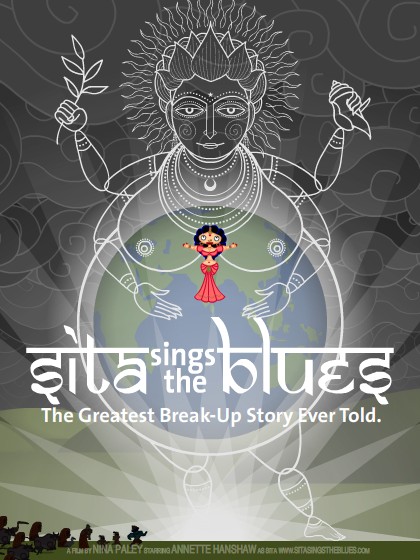
Poster A, or
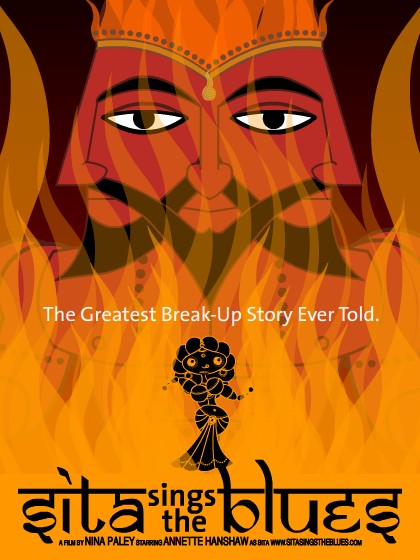
Poster B. Which is better? Which will get more people to show up? I gotta decide soon.

Animator. Director. Artist. Scapegoat.

UPDATE: newer poster designs above
Please help me choose a poster design to take to Berlin:
Poster A, or
Poster B. Which is better? Which will get more people to show up? I gotta decide soon.
Both of these are my favorites, but between these two, I think poster B is more attractive and readable (How does the tagline “the greatest” look on the top instead of middle?).
Poster A, if saturated and given more contrast, might also work. It does have more stuff happening in the scene than poster B.
I know you’re short on time, but if you can get other shots from your reel, i think the last shot of lakshmi winking and the peacock gramophone etc are cool (the gramophone was pure genius).
If you do an online campaign, the shot of lakshmi/sita in the water (with that wavy hair) is a nice one. there’s something about the way that hair waves that attracts attention/mesmerizes.
OK, just to make things difficult, I’ll vote for Poster A.
Actually, I DO like it a little more than B.
Good luck at the big festival!
i like A better which probably means that B is the one that’s going to work with The Public, since my choices are never in synch with what The Public wants, needs or prefers.
the reality is that theyre both excellent.
i want a copy of A for my living room.
roz
I’ll make it easy for you: it’s the poster B.
(…and I’m not going to tell you that I actually tossed a coin between those superb posters…)
Poster A: covers the whole feminine angle better.
Poster B, absolutely.
I pick poster A.
It would be a little better if Sita could be slightly larger in it.
Both are great. 🙂 Have fun at the fest!!!
OK, from the for-what-its-worth category…
I like B overall better than A.
What I like about B is the how the quality of your production design shows in it, and it sets up a male/female dynamic unlike A. The saturated colors in B give the sense of emotion and passion more than the largely neutral and less saturated A.
What I like about A is how Sita is in color. I feel that B makes Sita into an icon more than a person or character.
Her pose is a lot more interesting in B as well. That’s my 2 cents.
Prefer A. Unusual colors, more true to story. I’d move the tagline a little further from the title and make type smaller, tracked and all caps. Always loved this poster!
And congratualtions!!
My sister and I here both prefer Poster A. Looks great, can’t wait to see the film!
Thanks everyone! Not only do I appreciate your help, but your comments are fascinating.
More men apparently prefer B, while more women prefer A.
Keep the comments coming, please. I’m already refining both designs according to feedback here.
I have to say I like A.
I think I liked it better, because of all the little characters, at the bottom left. I wanted to know who they are.
I liked the idea of Sita, standing in India,( gives me the idea of World wide appeal) and I think it also portrays, the feel of the culture.
Something I thought of, though I don’t know it matters at all. The poster is in English, from that, can you asume, the movie is too. What I’m getting at , you never know if it goes to India, that might be something to concider.
B, although I think it still can be fine-tuned.
– Sita doesn’t stand out enough
– There could be some smaller details beside the bolder composition
– Some blurb at the top?
– Prepare for some space to paste the date and place of screening in
Do you already know where to print it and how many? I can recommend http://www.laser-line.de/ especially for flyers and smaller stuff. Reliable and good prices, and you can do everything online. Feel free to contact me for help.
Oy…. This is really a hard to choice! I love A, but I think B works better as a movie poster, with its implicit CONFLICT (menacing looking man, charred but still sexy Sita, and flames are always good eye grabbers – they worked for Gone with the WInd….)
B for sure. It has that “come up and see me” look. And as Ken said…It worked for Gone with the Wind. I can see it in the Art theater poster window. I understand that a letter from your Mom won’t get you into that venue but maybe one from a prenatal friend would do. MZLTOV kid.