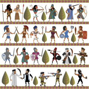
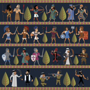
Months ago I had the idea to design some This Land Is Mine fabric, get it printed by Spoonflower, and quilt on it. But I never got around to the designing part until today. What do you think? Light background, or dark? The design of This Land Is Mine was inspired by Assyrian wall reliefs, and this expands on the style. I’ve never used Spoonflower before but it seems worth a try.


For a quilt, dark background. More impressive when hung on a wall.
My daughter uses Spoonflower to make custom artwork pillowcases that she sells. She seems vary happy with it. Hit me up offline and I can put you in touch with her.
Just a suggestion; you could give it a desert sand tan/khaki background. I think that would help give it an older middle east feel. It really looks wonderful! This reminds me of Disney’s Silly Symphony “Egyptian Melodies” with the moving hieroglyphics. It is quite fun:
http://www.youtube.com/watch?v=L1j7uhwDGsc
Regards, Dalton W.
hallo nina
the light one looses the drama like the Bayeux Tapestry
i have no idea if you like drak blue as a color but it could bring out the figurs more than the black or dark gray
greatings ludwig
I like the dark one but a quilt could have one side light and the other dark and you could then change the look at will!
I love it. Dark grey is great for making the characters pop. The dark neutral background emphasizes the cartoonishness of the characters, but an olive or sandy-colored background of a slightly lighter tone than the characters might give it a more solemn feeling.
I vote for dark grey too. Just yesterday I read a quilter’s regrets about choosing a blah beige-y background fabric for her quilt which turned out to be washed out.
I vote dark background!
dark
Dark… or light sand?
Don’t you have Brainflower in your cartoons?