Work in Progress: the $1K Quilt

$1Ktest2_01

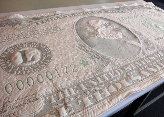
This is a TEST of the One Thousand Dollar Quilt, conceived as a more affordable version of my handmade Ten Thousand Dollar Quilt.

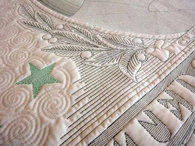
$1K_laureldetail

This is a test, it is only a test. We stitched out two versions to see how the quilt plotter would handle it, how the thread density would look, etc. There’s well over half a million stitches here, and it took the plotter about a day to stitch. Then I spent half a day cutting, sewing, and ironing binding, and binding it.
$1KRae
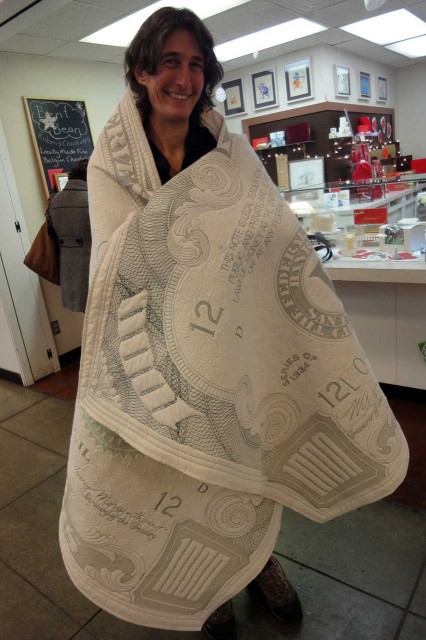
Rae Spooner of Bent Bean Chocolates (Urbana, IL) enjoys the cozy warmth of One Thousand Dollars.

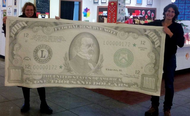
It’s about 8 feet long. The front is high thread count unbleached cotton muslin, the back is regular thread count same. The batting is a mystery – either polyester or poly-cotton, not sure because it’s left over from another project Theo bought it for, and he doesn’t remember. The quilt is remarkably soft and flexible given all the dense stitching

$1K_rtcloseup

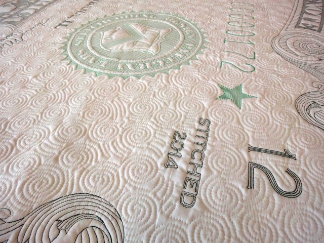
Unlike theĀ Ten Thousand Dollar Quilt, which uses reverse applique, this gets its color solely from the thread. The result is lower contrast, but I like all the stitch lines. Also there’s no way I could do a reverse applique version for under a thousand dollars.
$1K_SFseal
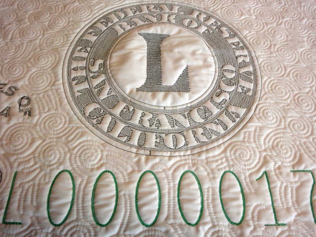
The bright green thread is 30-weight, thicker than the 40-weight dark green and white. What a nice solid effect it gives.

The thread is polyester: the dark green and white are 40 weight, and the lighter green is 30 weight, which is significantly thicker. We may do another test using 30 weight dark green. Heavy thread works beautifully, but it’s very expensive. Then again for a Thousand Dollars we can use expensive thread.
$1K_1000closeup

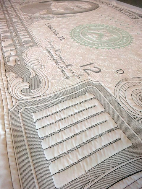
Registration is off as expected, but could be worse. He have a strategy for improving registration in the next test.
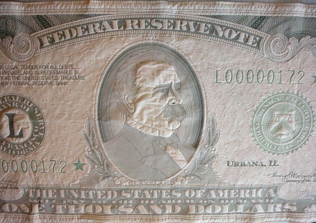
$1K_center
Medallion background fill will be crosshatched in the next iteration.

The portrait medallion fill will be crosshatched in the next version. I didn’t like these curved shading lines at all, because the machine double-stitched some of them which ruined the gradient effect. The next version will also have fill lines on Cleveland’s face, along with a larger border with more of the swirly fill.
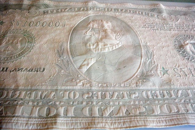
$1K_back
The back. We had a few thread nests but overall it’s pretty clean.
$1K_NinaRae_sm
Rae helps me hold up the 8-foot comfy currency. Photo by anonymous friendly woman who was trying to buy chocolate at Rae’s shop.
Share

My Tile Obsession Will Taper Off Eventually

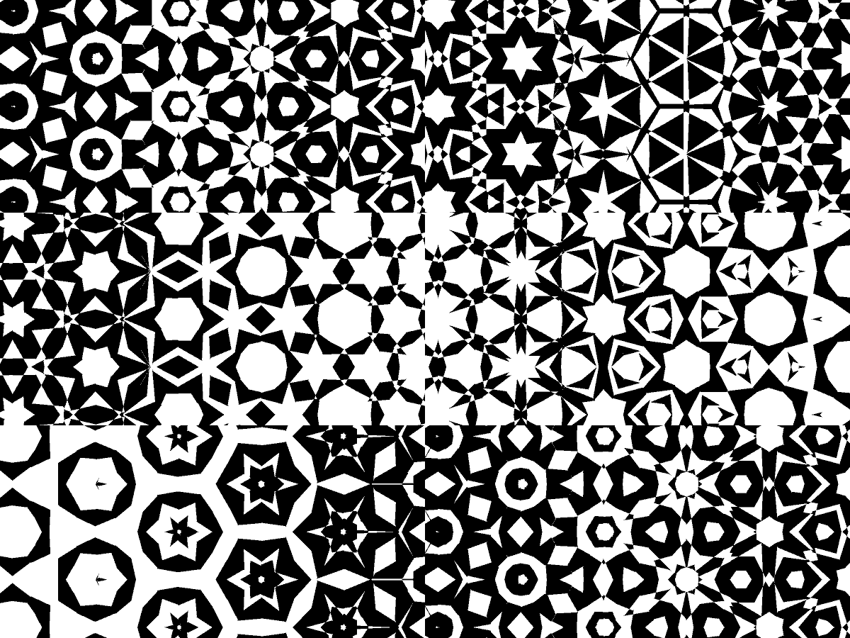
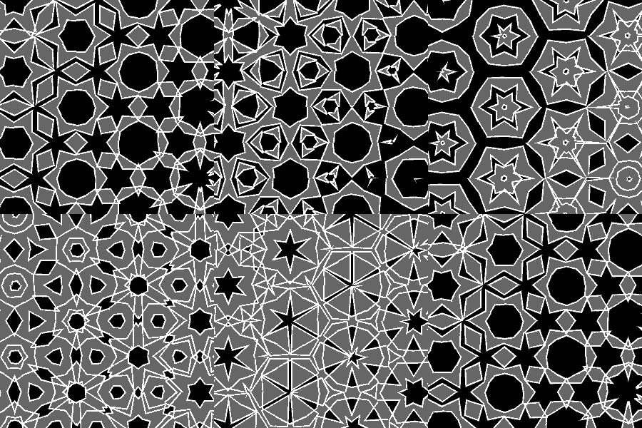
I can already feel it slowing down, which means I’ll have to find something useful to do soon. Meanwhile I wanted to see the morphing tiles as a 2-color map. Easier said than done: Flash crashes every time I try to convert the various symbols making up the outline into “shapes,” so I had to export a PNG and use the clunky old paint bucket in Photoshop. There’s an ugly thick outline I added to close gaps, in order to make said paint bucket work. But at least my 2-color curiosity is now satisfied.

It reminds me of the far-more-awesome M.C. Escher Metamorphosis poster I had in college. And although the thick outline and various other flaws make not-print-worthy, yesterday I made a color version that is:

I ordered a few yards of it from Spoonflower. I can’t wait – once I start quilting this stuff I might get re-obsessed for days!

Share

More Tile Fun

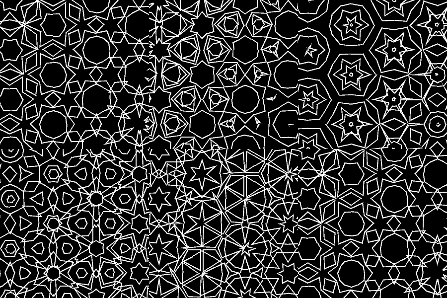
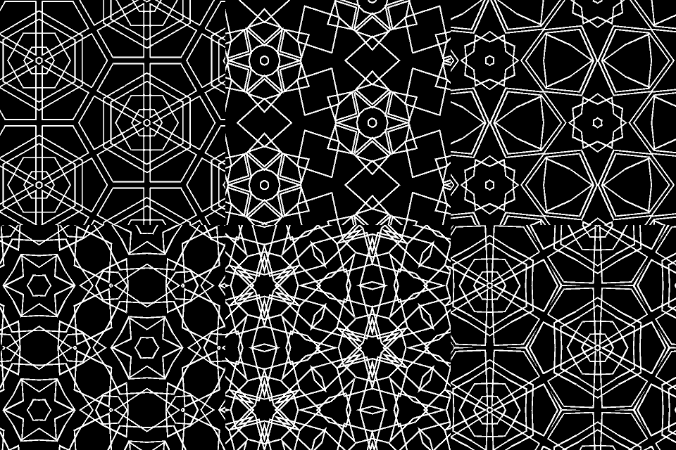
morphing tiles colormorphing tiles black and whitemorphing tiles outline

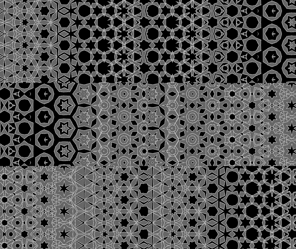
With a few adjustments the tiles can morph vertically as well as horizontally. I might prefer the just-horizontal version, but I’m not sure.

In some ways I prefer the black and white to the color. When it’s just outlines your mind can interpret shapes any number of ways. When a fill color is added they get restricted a little. With additional colors they get more locked into regions.

This is such a good project to work on while I have insomnia. Or maybe it’s causing the insomnia.

Share

Animating Islamic Tiles Turned Out To Be Easier Than I Thought

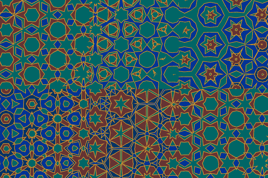
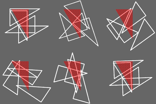
I had assumed animating Islamic tiles would be a big complicated endeavor but it only took a few hours of messing around in Flash to figure it out. I just made a half-equilateral-triangle mask and tiled it, then made a fairly simple animation underneath:

Single tile from the animation above. Red indicates mask.

Obviously all kinds of variations can be made from here. If only I had tried this earlier!

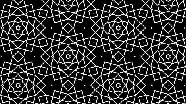
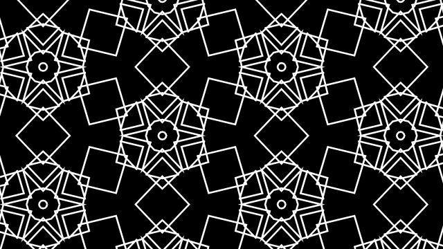
The reason this is a Big Deal for me, is I didn’t know how easy it would be to tile squares with hexagons. I thought if I made a hex-based system like this I’d just get hexagons and equilateral triangles, not squares. But look – there are squares all over the place!

see the squares?
more squares
Squares! Squares! Everywheres!
Share