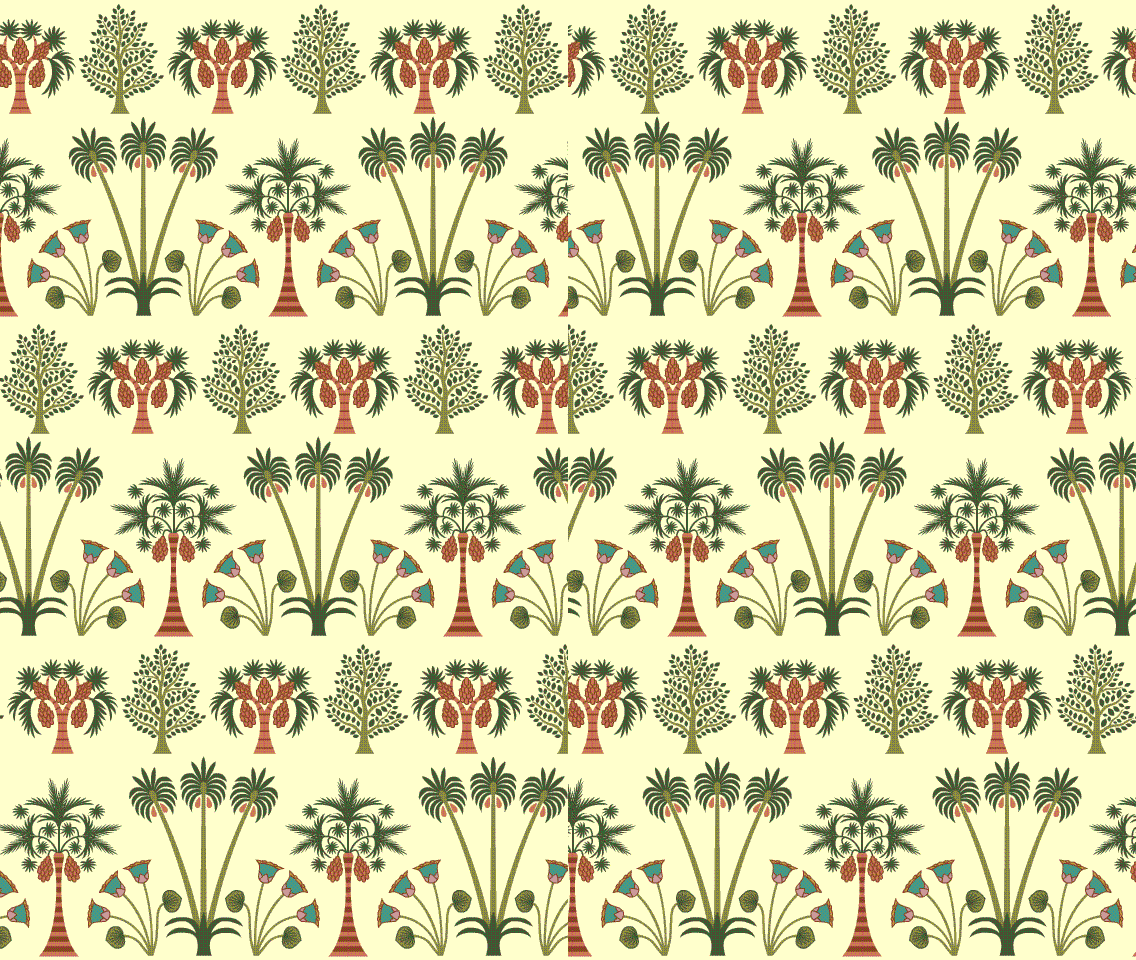
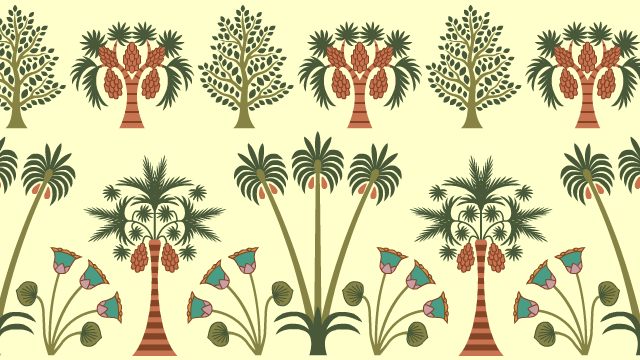
I’ve been designing Egyptian foliage for Seder-Masochism. The ancient Egyptian graphic style is pretty flat; there’s little if any perspective to give a sense of depth.
However, animation can give a sense of depth without compromising the graphic style. Thanks to the magic of parallax, each still frame looks authentically flat, but in motion the scene looks 3-D. Nothing overlaps anything else but there’s still a foreground and background.
 Just one of many reasons animation is cool.


Just think the Fleischer Bros. actually had to set up physical backgrounds moving at different speeds to get this effect.
good day!
I like the animation, I am a student and this kind of blogs interest me
Excellent information, I would like to try someday!
kisses