Funny how I have all these Sita Sings the Blues T–shirts, but none with a picture of just Sita herself. I want to remedy that. The question is, what color should the “Sita” shirt blank be? Colors I’m considering are: black, pink (“raspberry,” according to the Bella shirt co.), or creamish-tan. Which color should I choose?
As always, click the thumbnails to see larger images. Also: I put the “Sita Sings the Blues” logo on this design, but I don’t have to. Would you rather have a shirt with the logo, or without? So far none of the shirts I sell have the logo anywhere, making them kind of artsy and mysterious. Should I continue that trend?
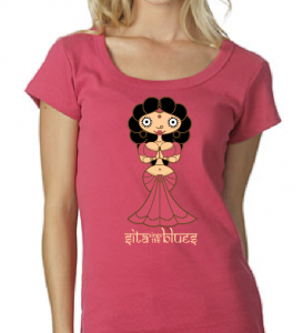
Here’s the design superimposed on the photo of a model wearing the Bella scoopneck “raspberry” colored shirt:
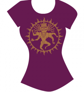
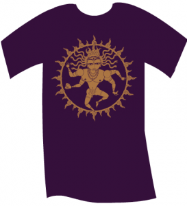
In related merch news, I’m finally going to produce some “Shiva Natraj” shirts. These will be blingy gold foil on beautiful shades of purple that I know are awesome: women’s “currant” and men’s “eggplant.”
But do please help me choose a fabric color for the “Sita” shirt. Thanks!

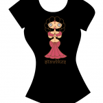
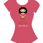
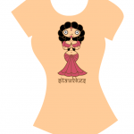
I honestly don’t like the fact that every one of the shirt colors matches not just the hue but the shade as well of some large, important element of Sita, and would probably cause her to blend in a bit from a distance. If you changed the shade of the colors of the shirts just a bit to make Sita stand out I think it’d work better.
But that’s just me. XD If I had to choose I think my eye keeps going to the raspberry.
It’s to save money – making the shirt base the same color as a “Sita” element means one less color of ink (and therefore screen) to pay for. Silk screen is high quality but expensive, and the more colors you have the more it costs.
I like the black one, but only if the lines defining her hair are sufficient contrast that you can actually see her hair. At the scale of those pictures, I can’t quite tell. Second choice would be the tan.
The Shiva Natraj shirts are awesome!
I like the raspberry but probably black is more practical. The flesh color is just odd and unappealing
I’m a fan of the Black & Raspberry. Creamish-Tan may look a little weird on someone who’s actual skin-tone is creamish-tan.
I like Sita without the logo, but the logo is kind of important. Is there a way you could have it printed on the back side of the shirt an inch or so below the collar?
It’s easiest to see the raspberry, and it looks the nicest in my opinion. The logo goes well with this design. If you leave it out some out-of-the-know people might think it’s some random design. Including it might prompt them to check out the film.
Which are the measures of the shirts? (waist, chest, etc…) I’d like to order but I have to know which is the size that would fit me
I kinda’ like the cream, maybe because black is so, well, BLACK, and all over the (artsy) place.
Ditto on the AWESOMENESS of the Shiva Natraj shirts. I think you should send one to Obama, tell him it’ll help him deliver on all this hope he’s been spreading around.
I love these designs. I love so many of the Sita shirts, as well as the copyleft, etc. I would love to own and wear a few of them, and to give them as gifts. I would happily purchase one for my own daughter, an artist and a fan of yours. But I will not support American Apparel and their extravagant promotion of a culture of sexual exploitation. There are better choices out there, and I encourage you to explore them. You may wish to begin here: http://www.nosweatapparel.com/
In solidarity with artists, women, and everyone who longs to speak freely,
~Shiva Wolfe
Shiva – for what its worth, most of our women’s scoopnecks are Bella, not American Apparel. Women’s camisoles are made by Anvil. I will check out No Sweat Apparel for future runs.
Cream for the Sita shirt (and you know what my visual opinions are worth).
Thanks, Nina! I’m ordering prints, and a Laxmi pendant for my girlie.
~Shiva
Black doesn’t work. Her hair disappears. I think that Raspberry works better than tan, but it’s a close call.
Wayne
the pink and the black ones with sita.

the purple one with ravana… though the motif is a lot like nataraja to me.
The black one is going to be the most dramatic. I assume
Sita’s black hair will be set off by some sort of halo.
The Shiva Natraj shirts look terrific.
I’m fine with the red and black. I don’t like the cream, as Pawl said, it might look weird on someone with creamish skin.
Being contrary, I vote for none of the above.
Why not do blue like the background for the “Sita Sings The Blues Merchandise Empire” button on the top of the sidebar.
Since Sita has blue eye shadow, if cost of a screen is at issue, darken her eyeshadow a bit and use that. Since the only blue is in the middle of her face it removes the conflict that all the other colour choices have with bleeding the hair, skin or dress into the background.
Sita is the star, she needs to stand out from the background.
Hi Nina,
I am trying to talk my local bookstore into showing SIta, which I thoroughly enjoyed (so did my family).
Do you ever make personal appearances to go along with a screening? He’s big on that. It’s a pretty special indy store that has had international talent many times before. We’re in central Jersey.
Thanks and peace,
– danny
It does bother me that the hair disappears on the black background while the dress disappears on the pink background. Of the three proposed colors, I think the design works best on the flesh tone background, but who wants to wear a flesh colored T Shirt? If the hair could be made to show up, I would choose black.
I like the raspberry and vote for no logo.
How about go with raspberry but outline the image in black?
I like the black and the raspberry (and I’m totally ordering the Shiva Natraj shirts).
We just saw Sita at CinemaSalem (in Salem, MA), a couple of nights ago, and it was fantastic. Thank you.
you need some contrast, Nina.
Actually, I go more for rasberry. Black does make the hair dissapear.
Dont insult Sita if you cant repect her!!!She is not there to paint on T-shirts.. value Hindu’s sentiments!
Hi Nina!
I vote raspberry – Sita’s luscious femininity seems to demand pink.
Plus, while the black looks really good and dramatic it’s a more common color for t-shirts, which will make the pink stand out. So pink first, black second. The vanilla doesn’t work – I don’t know if this will make sense but it looks lower quality, even though I’m sure they’re all the same.
Always love looking at your work – hope all is well with you!
I’m concerned about the sizes available for the American Apparel t-shirts. As a writer friend of mine (who loves Sita) said when looking over my shoulder at the online store, “I’m three times the content.”
Seriously, many writers I know come in larger sizes than XL (esp. a small-running XL). These are women who came out of the earliest days of print fanlit and who managed to go pro despite the prejudice against such women’s writing (esp. bad back in the 70s and 80s). There was a LOT of copyright argument and anguish in those days…so, they’re perfect sources of energy for content freedom.
Thanks for all your efforts and for SStB!
I’ve gone back to Bella shirt blanks for women. They too only go up to size XL, but at least they’re a little bigger than AA women’s shirts. The AA mens’/unisex shirts go up to much larger sizes. The 2XL is huge.
If YOU want to offer Sita shirts in larger sizes for women – including sourcing the blanks – please be my guest. Sita t shirt designs, like everything else that comes of the film, are copyLeft (CC-BY-SA) and you’re welcome to create a business on them.
I like all of the colors for Sita. But raspberry is my fave. I don’t see it for sale yet. ???