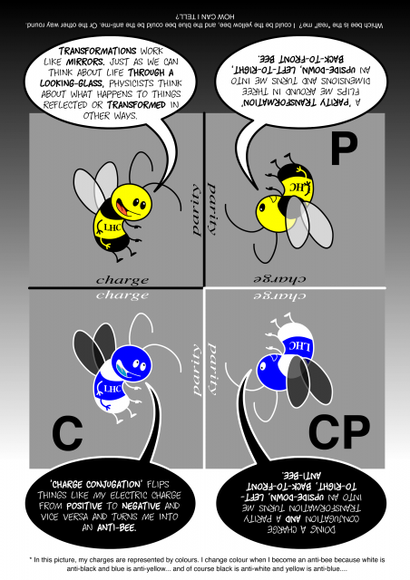
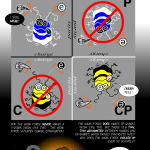
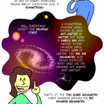
During the Spring of 2001 I had the privilege of freelancing for CERN‘s Public Relations department in Geneva. My task was to try to explain what scientists were seeking in the Large Hadron Collider, especially an explanation of asymmetry. For this, I created possibly my best informational graphic ever:
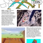
Unfortunately CERN never used this, nor the 6-page pamphlet it was part of. But now that we have a more mature interwebs, I can share all 6 pages right here! Click on thumbnails below for high res PNGs (except for page 6, which was too big as PNG so is instead JPEG).

These are super cool Nina, and all the awesome stuff you’ve been digging out of the offline archives has made this week lots of fun too. Thanks for sharing.
…and for the first time I get what the big deal is. Thank you!
Aww!
Where’s the page about Armageddon and implosion?
😛
“Kewl!”
These are great, Nina!
Love the anti-bee.
What I especially like, Nina, is the way you “embedded” information deep in the physical stuff of the illustrations, like the mirror-reversed printing and the color inverse of the anti-bee.
I’m impressed. Too bad CERN didn’t use it. I have a hunch if they had, more people would understand/appreciate the LHC and not just think it’s “that thingamajigger that’s supposed to destroy the world or something”.
Hi Nina! It’s a shame the CERN didn’t use your work. It explains everything very well–and it’s fun. 🙂 We are anxiously awaiting a screening of Sita here in the Geneva area (we missed the festival in Annecy earlier). Thank you for your excellent work–both the art and the copyright information. Best regards, Lyse
I agree that CERN missed a golden opportunity. I was looking at the PNG’s and my wife asked about them, so I printed them out at work (color printer available). She enjoyed them thoroughly!
cool beans.