There’s a hotel in Champaign called the I-Hotel, which I call the I-Hole because of its logo:
The “I” in the “H” reminds me of this:
Of course, the I-Hole is located across the street from the A-Hall:
I entertain myself how I can in this town.
Animator. Director. Artist. Scapegoat.
There’s a hotel in Champaign called the I-Hotel, which I call the I-Hole because of its logo:
The “I” in the “H” reminds me of this:
Of course, the I-Hole is located across the street from the A-Hall:
I entertain myself how I can in this town.
Working on new tessellating animated gif tiles led me to revisit my older tile experiments, and repurpose for website backgrounds. I originally made these animated mosaics in Macromedia Flash 8 for my section of the feature film The Prophet.
I tried recreating the mosaics in Moho, but quickly became frustrated. Moho’s masking is very unlike Flash’s; in fact Moho’s everything is very unlike Flash’s, and where Flash excels at this type of mechanical construction, Moho favors the organic. Rather than figuring it out anew, I fired up the ol’ 2007 PowerMac and dug into my old Flash files. I exported as Quicktime Video with an alpha channel and copied to my less-ancient 2014 Mac Pro. Moho couldn’t read the old Quicktime format, so I exported again as Apple ProRes 4444, dropped it into Moho Pro, fiddled about with sizing, and eventually exported this transparent gif that will permit cartesian tiling even though the underlying shapes are hexagonal.
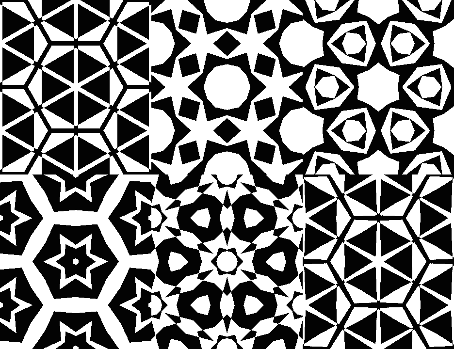
In the process I discovered this cool website that will generate a “sprite sheet” from your uploaded gif. This would have been convenient back when I was designing morphing tile fabric patterns, but back in those days – the days Flash still worked – I had to do it manually.
Speaking of Flash, Adobe just announced it’s dead forever. Wouldn’t it be nice if they released Macromedia Flash (you know, the GOOD version from before they bought and ruined it) so others could develop it?
I’ve been collaborating with Alex Gleason on a new social media website, and he proposed a background of the animated fish from Seder-Masochism:
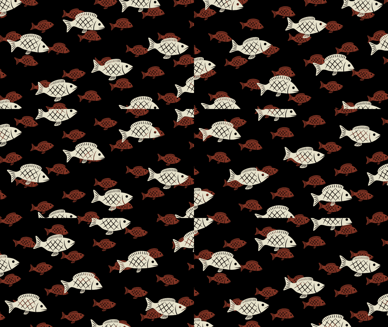
But how to scale it up for a full background? The gif above is 1.6 MB, it can’t be any larger without significantly slowing loading times (and eating up data on mobile devices). I thought I could maybe make a tessellating animated gif tile, and so did Alex, but it turned out to be much trickier than I’d anticipated.
In a way, a looping gif is a tessellation of time: it seamlessly begins where it ends. That isn’t so hard:
But it doesn’t tessellate in space. If you tile the fish above, you’ll see “seams” at regular intervals. Making the fish line up seamlessly, while moving, required going “under the hood” of the original animation, re-sizing and retiming everything, and carefully positioning and scaling by eyeball. I won’t go into all the details and mistakes, but after some hours I eventually got something that works almost perfectly:

Now get this: it’s under 160 KB. That’s right, less than one-tenth the filesize of the gif at the top of this post; smaller than most jpegs of similar dimensions (360 x 360 pixels). But it covers an entire browser window, no matter how large. Here’s a screenshot showing it tessellating in space:
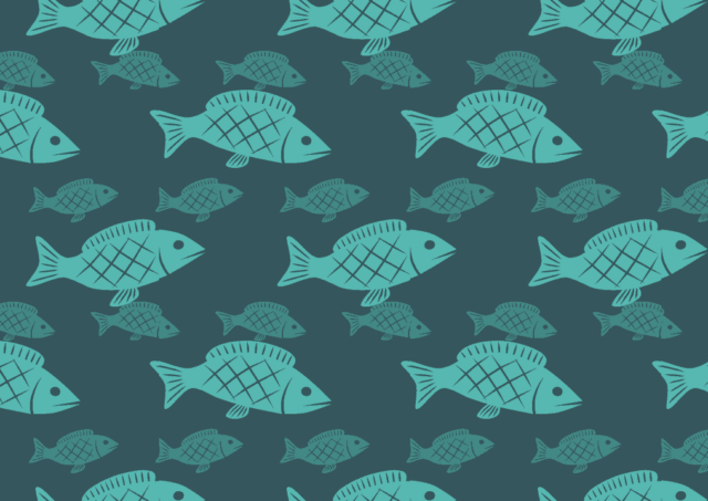
To see it tessellating in space and time, click the image above or go to https://alexgleason.me/fish/ .
Update: I made a smoother version. Above is 12 frames per second, below is 24 frames per second. This makes it smoother and less headache-inducing, but doubles the number of frames and therefore file size, and the seams are more visible.
First I wanted it to be 1.25″ tall, and a cut-out shape:
But this would snag on clothes, and bend. So I came up with this:
But it looks like a bottle opener. Plus the Chinese pin-making company emailed me back that a cut-out like this would have to be at least 2″ long. So instead of cut-out details I designed for 1.5″ hard enamel:
But then I thought to make the details shiny metal, and the main area color, with a thicker outline that would make the pin more stable:
But then I thought, why not make the details another color, with gold outlines:
But then I thought, hey why not put a sun in there, since the Great Mother gives birth to the Sun:
Then I made a bunch of different Sun designs, finally settling on this one:

Et voila:
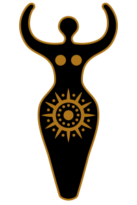
Except the sun shape needed just a little bit of softening, so I exported it as a PNG, re-imported it to Moho (where I’ve been doing all this designing), and auto-traced it. Et voila:
And that’s what I hope to have made in China, until I change my mind again.
ONE DAY LATER: I changed my mind again. Now She’s a little stouter and has crescent instead of full moons. I made so many slight modifications to the shape I started to go crazy trying to decide, because each had its strengths and weaknesses. Eventually I had to just commit to one, so here’s what I just ordered 200 pins of:
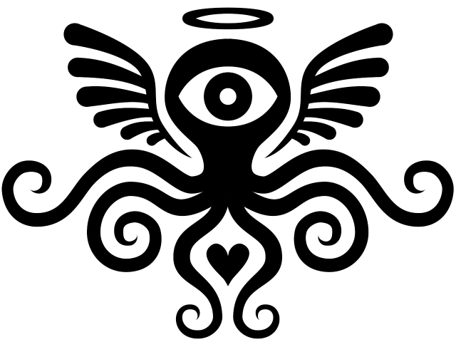 I needed something to visualize while I’m in pain. The Angel O’ Death is nice, but pain isn’t death; in many ways, it’s life. So this morning, I asked the Angel of Pain to show itself to me. And this is what I got.