This outstanding use of animation and design to illustrate otherwise difficult or dry concepts is by Dermot O’Connor.
Category: design
Brown Outlines FTW
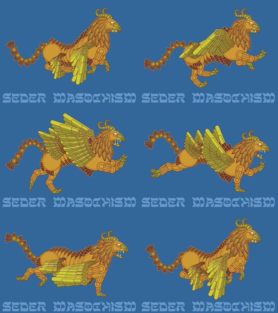
 See, this is why I leave myself open to comments, even though they can cause discomfort. Sasha Rubel made an excellent suggestion. On areas that were already brown, I used gold outlines.
Ziz of a Different Color
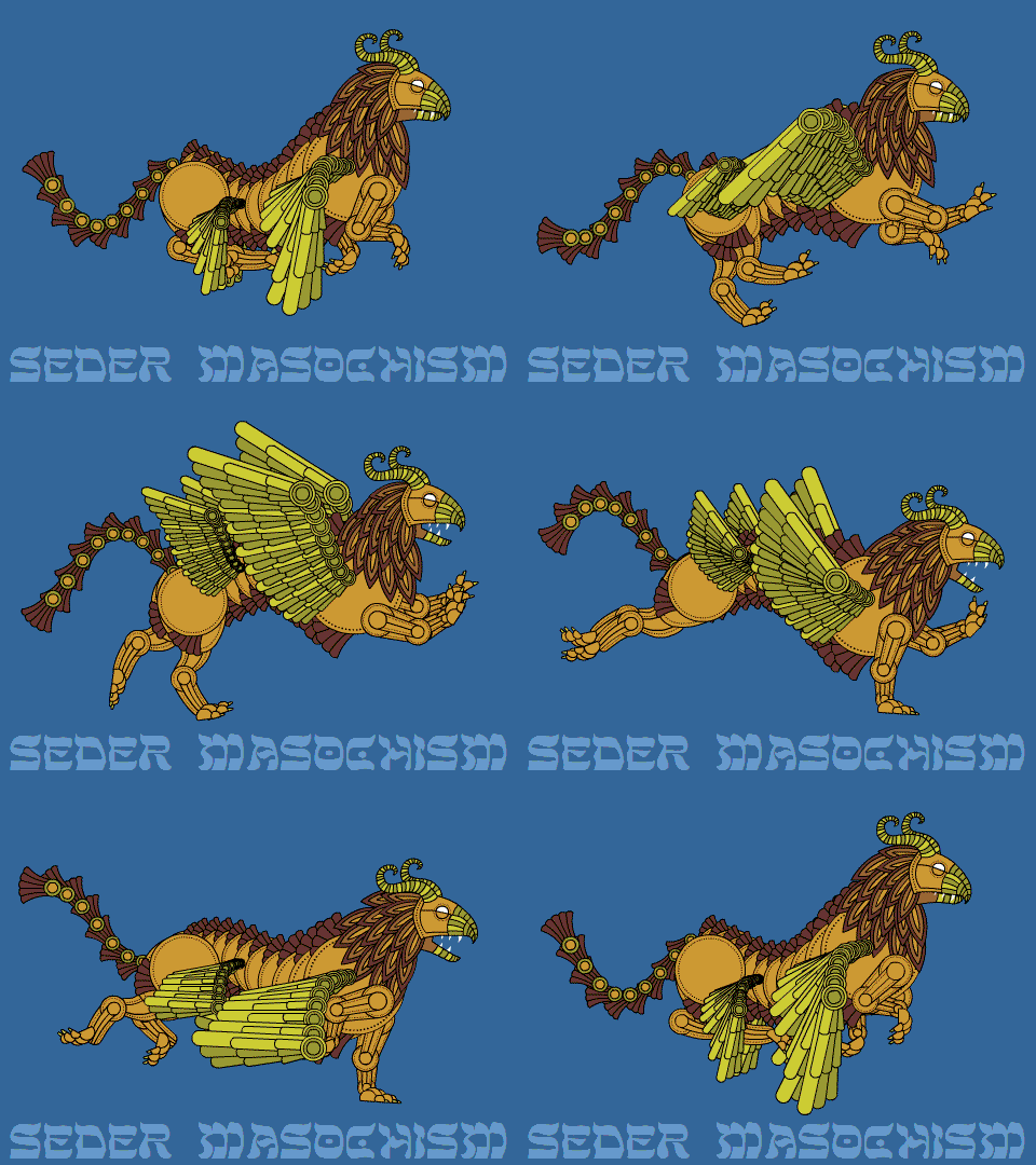
Two Zizzes, actually. The first has black outlines, which are thicker in the animated gif than the source file:
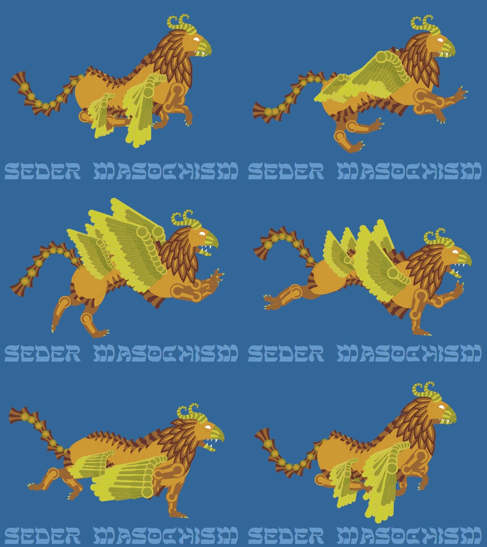
 The second has no outlines, reminding me of 1930’s travel posters.
 Maybe this Ziz is on its way to visit Palestine.
More Zizzy color
Slight improvements? Or exprovements? Either way, I’m still fiddling and posting the Ziz as it develops.
I’ve only just learned that if you post a work in progress, everyone wants to tell you how to change it. Not once did I request advice, but advice is clearly what I’ll get if I post unfinished work (or finished work, come to think of it). I’m free to ignore any or all of it; everyone on the interwebs is just talking, they don’t have any power over me unless I give it to them. I can “take what I like and leave the rest” – and sometimes someone offers something useful. (Of course praise is always useful! It’s like water and sunshine to a plant.) Instead of criticizing the critics, which was my initial impulse, I’m remembering that it’s my choice to post these W-I-P’s, and my choice to accept or ignore people’s “helpful suggestions”, and that I’m actually in control here.
If I can learn to do that here, I’ll be better at living with criticism elsewhere. As my daily prayer says:
…forgive us our criticisms
As we forgive those who critique against us
So whether you’re criticizing or praising or ignoring what I post here, I’m benefiting by getting a little stronger and growing up a little more. And hey look – a ZIZ!


