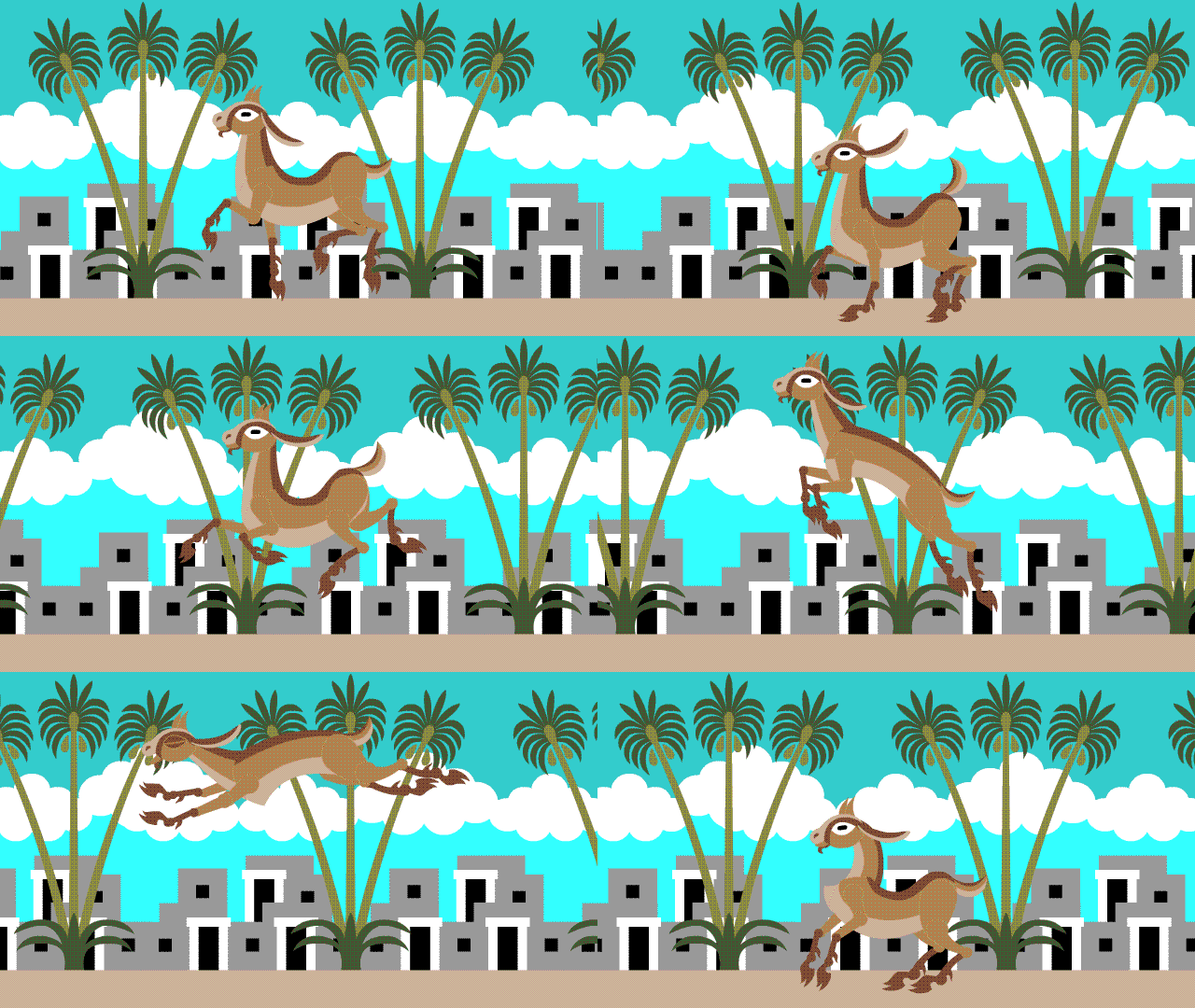
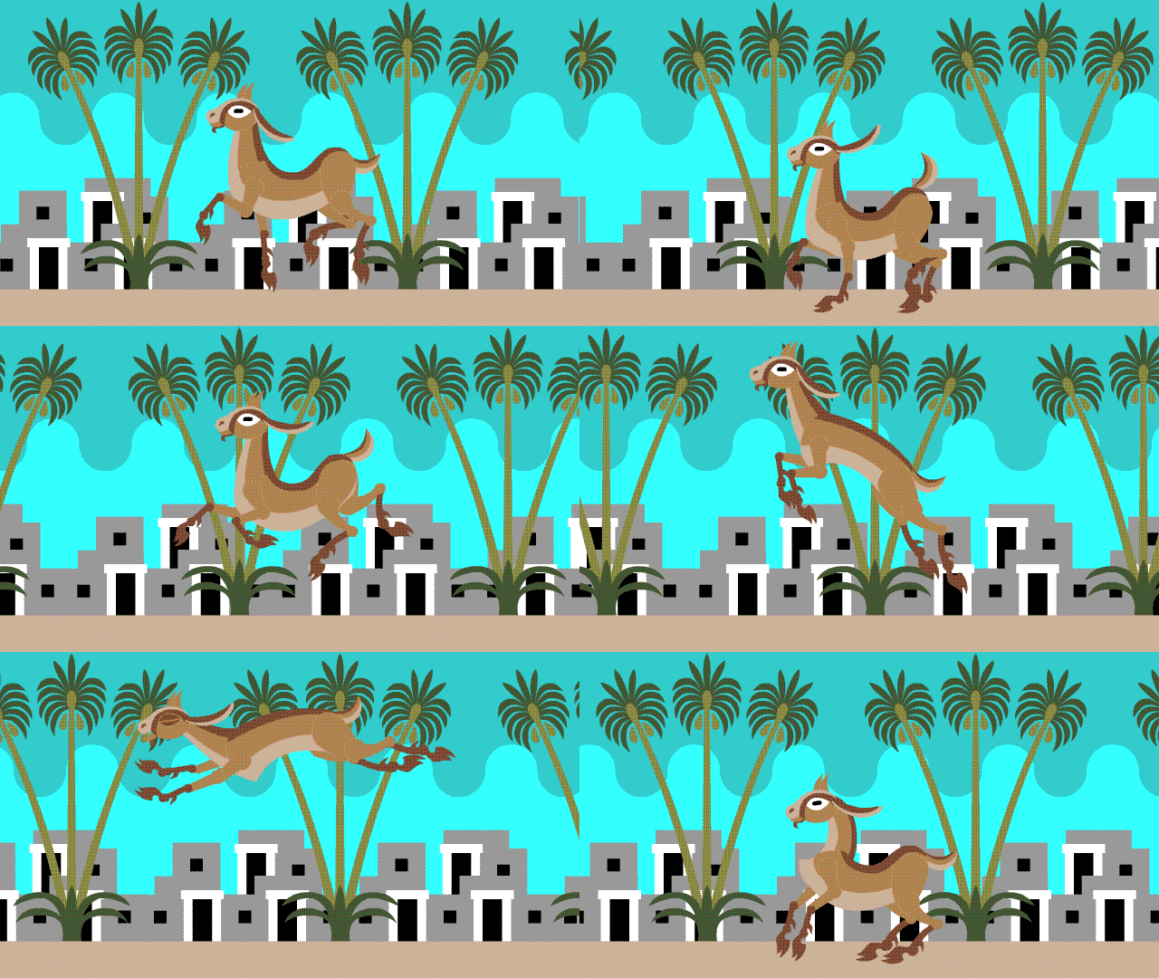
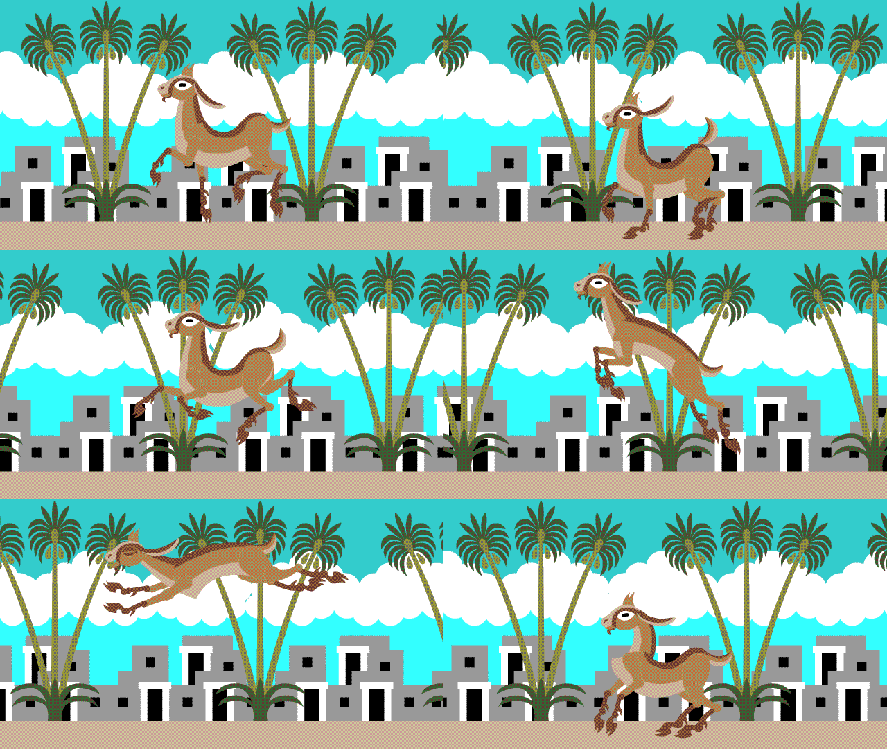
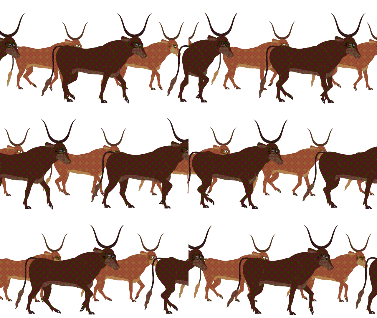
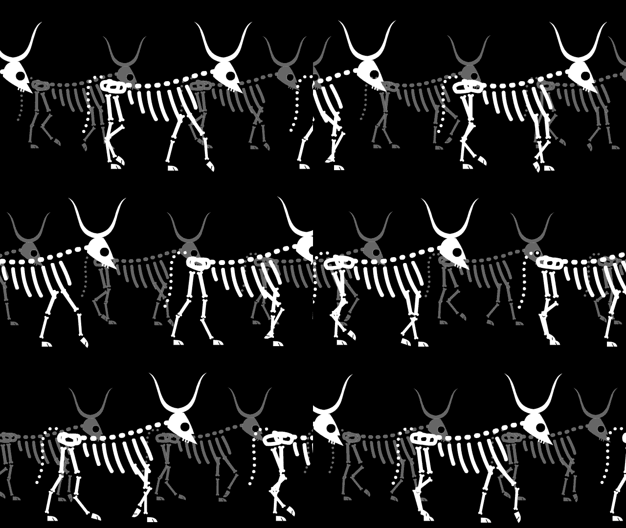
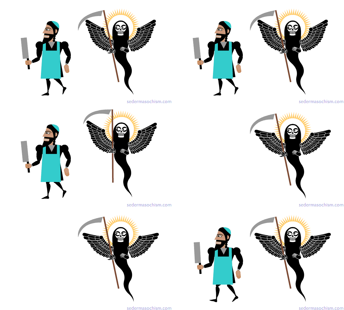
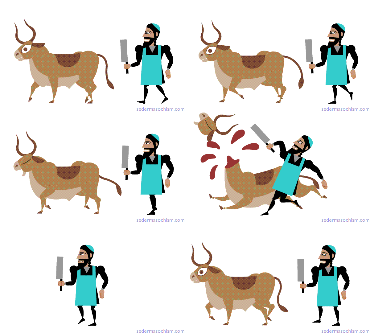
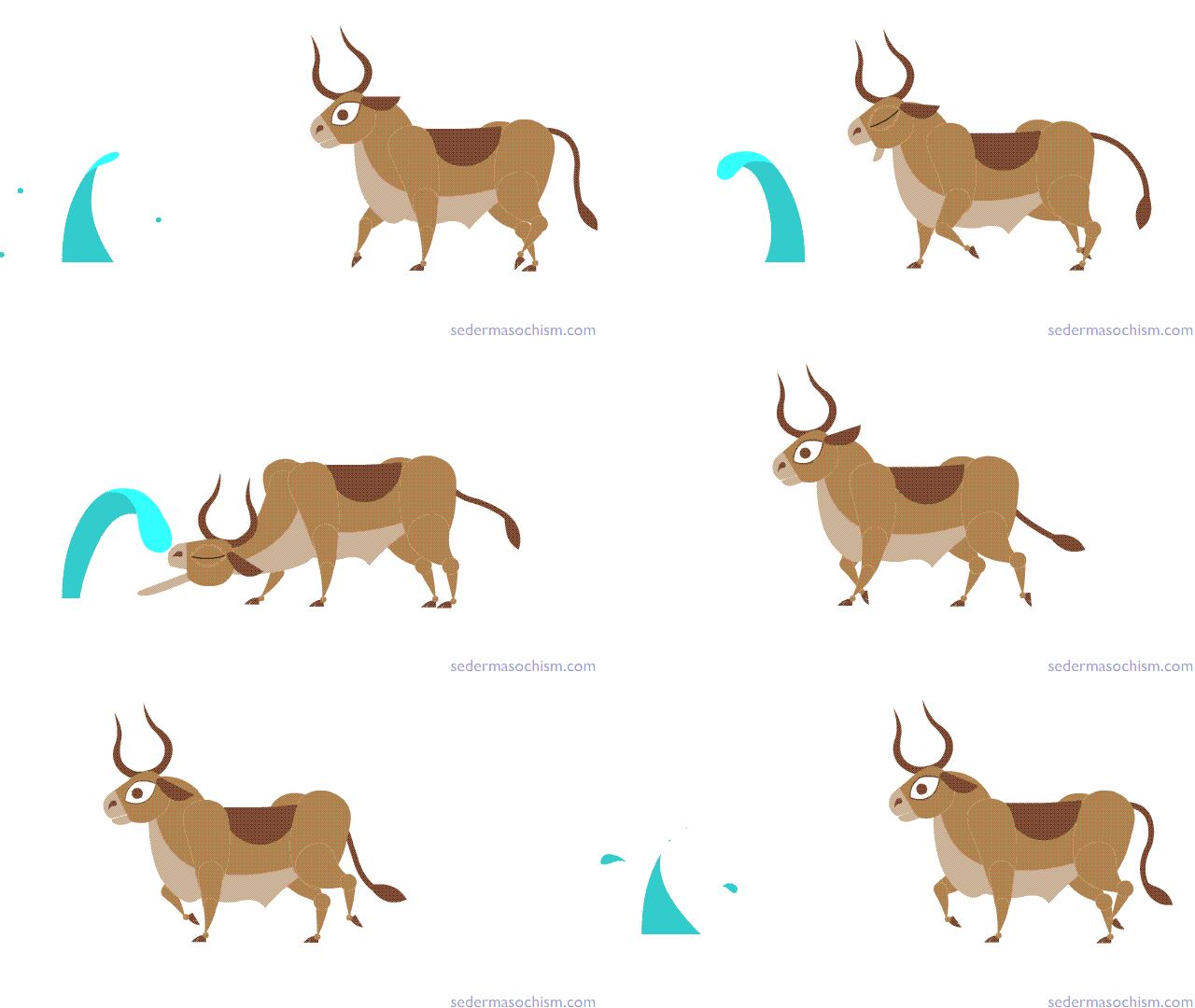
Which 24-frame cycle do you like more:
Cycle A, “Clouds”, or…
Cycle B, “Waves”?
I personally prefer Cycle B, because I like backgrounds where everything is moving – I feel it gives it more depth. As a 2-D design the clouds look nice, but in an animated cycle their stillness bothers me. I did make a version with moving clouds, but on this 24-frame cycle they had to be very dense to repeat:
Cycle C, “Repeating Clouds”. I still prefer Cycle B. The sky pattern might be a bit unconventional, but I think it’s stylish. Also I don’t like all that white in the background of A and C.
The palette is limited to 10 colors because this is destined for Embroidermation. The animated GIF doesn’t have great color fidelity; thread colors will look better and have more contrast between foreground and background.
If you have an opinion on which of these you prefer, please leave it in the comments and maybe it will help Theo and me settle our argument.

