Inktober 2016, October 19-22

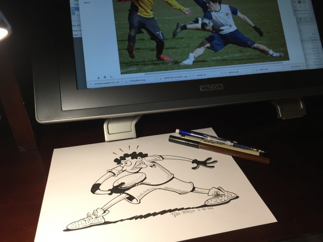
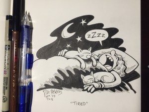
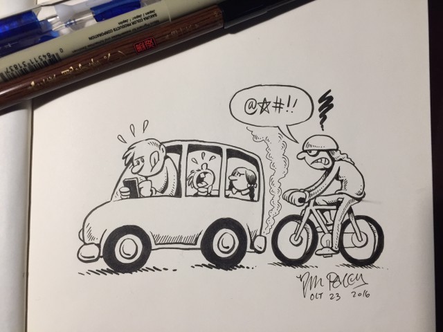
I noticed some artist and animator friends were posting drawings with the hashtag #inktober. This is the sort of thing I never do. But it had been years since I’d respectfully drawn with ink on paper, and I kind of missed it. So I ordered myself some different brush pens, and the day they arrived I sat down and drew these:

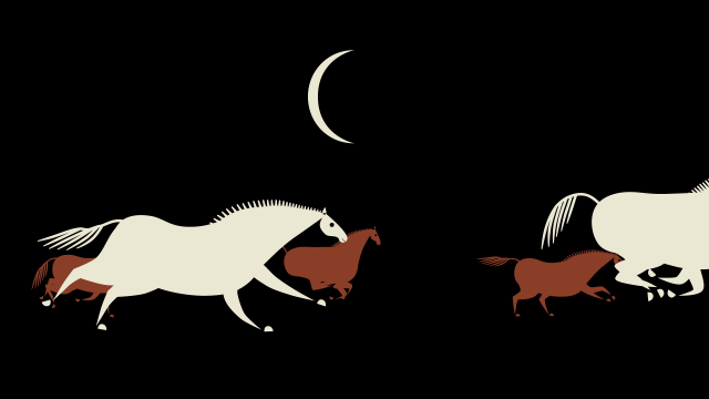
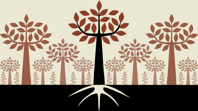
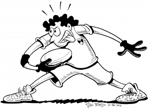
"Flight"
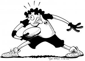
“Flight”

No warm-ups, no practice, just bam, out they came.

It’s been more than a decade since I’ve drawn in this style, with ink on paper. I’ve avoided it due to burn-out from drawing daily comic strips. Advice to you kids: turning something you enjoy into a daily job is a great way to make you hate it. I quit my last daily comic, The Hots, in 2003 (before that I did another mainstream daily, Fluff, and before that was my self-syndicated weekly Nina’s Adventures, the entire archive of which you may download here.) I guess 12 years is enough time to recover from style burn-out, at least a little.

“Inktober” has a list of “daily prompts” and I decided to just follow them:

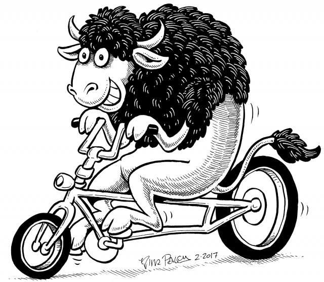
"Squeeze"
“Squeeze”


Squeeze_BW
“Squeeze” processed in GIMP to function as a black and white illustration. This is from the same photo I took with my cel phone. No scanner needed, apparently. Welcome to the future!
"Big." I'm really liking that Uni Mitsubishi brush pen, more than the nylon hair brush pens I used to use professionally. It'll wear out fast because it's a compressed felt tip, but it sure is clean and easy to use.
“Big.” I’m really liking that Uni Mitsubishi brush pen, more than the nylon hair brush pens I used to use professionally. It’ll wear out fast because it’s a compressed felt tip, but it sure is clean and easy to use.
"Big" cleaned up. in GIMP, sans scanner.
“Big” cleaned up. in GIMP, sans scanner.
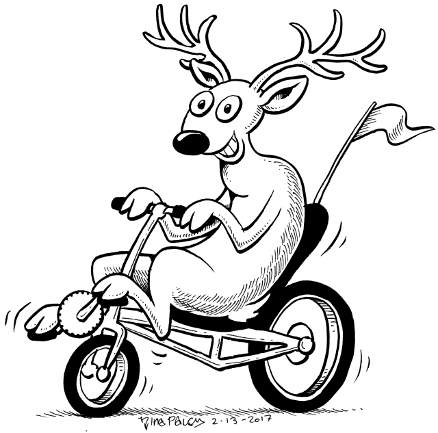
"Little"
“Little”
"Little" cleaned up in GIMP, from that same cell phone photo.
“Little” cleaned up in GIMP, from that same cell phone photo above.
I actually did 2 versions of "Little." The one I posted before was outlined with the double ended Uni Mitsubishi felt brush pen. This one was with the Pentel Pocket brush. Never thought I'd choose a felt over nylon hair brush, but there you go.
I actually did 2 versions of “Little.” The one I posted before was outlined with the double ended Uni Mitsubishi felt brush pen. This one was with the nylon hair Pentel Pocket brush. I have less patience for messiness now, I guess.

Honestly I’m enjoying this so much right now I’d kind of like to take on an illu$tration gig while I’m still fresh. Too much of that and I might burn out again, but right now it would be fun.

Share

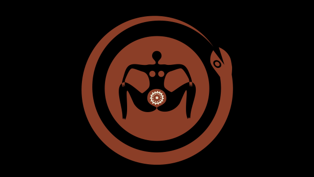
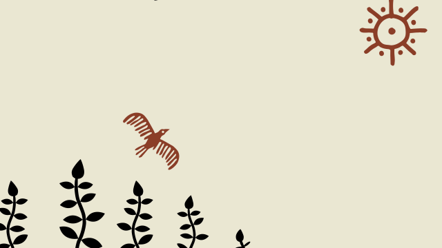
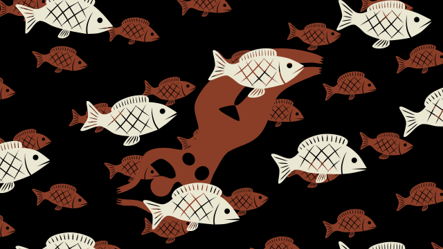
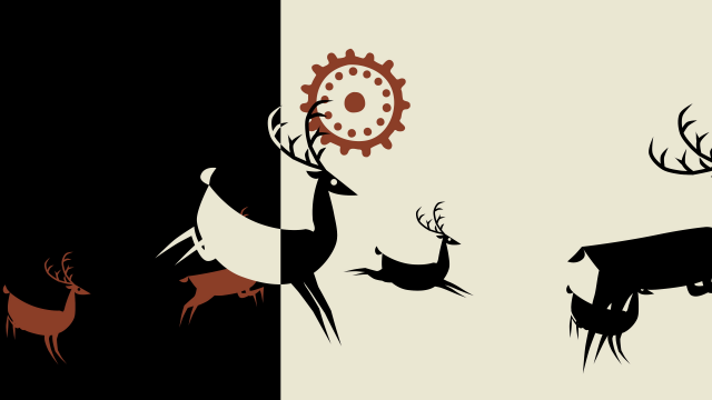
Chad Gadya embroidermation finished at last!

After a little over a year and a half, and many interruptions, we finally finished our embroidermated short, Chad Gadya. While we were working on it (actually I was working, Theo was procrastinating) this other embroidered short came out, but there are differences. Thanks to Theodore Gray’s stitchcoding in Mathematica, we weren’t restricted by (invariably crappy) off-the-shelf software. This allowed us to automate beautiful iridescent stitches and preserve them from frame to frame, so the resulting animation really looks like moving embroidery.

Every single embroidered frame you see here is available for sale, signed and numbered and one-of-a-kind. Only 9 months ’til Passover!

Chad Gadya will function as a sort of “intermission” in my feature film Seder-Masochism, marking the end of the Passover meal but just the beginning of the Israelites’ trials in the desert.

Update: Theo’s post on the technical side of stitchcoding embroidermation.

“It took a while to get all this code right, but of course it’s crucial that it cover every possible case, because when you’re doing animation, it’s not about getting one frame right, it’s about having an automated process that always gets every frame right, not just once, but every time there is an iteration of the animation requiring a re-render of the frames. We must have generated tens of thousands of frames (just generated the files, not actually stitched them!) before it was all looking good.” Theodore Gray

Update 2: All the stitching files we made for this are Free (CC-BY-SA) at archive.org! Download ’em and stitch ’em out as you please. They’re PES format; wish we had something better, but all embroidery formats suck.

Share

Linoleum cut printimation

Death9

These are some lousy test prints (I have no skill as a printer plus I used cheap water-based ink and cheap thin waste paper) I made of some linoleum print plates I designed and “cut” with the laser engraver at the local Fab Lab. The plates are to be part of a larger project with many artist participants, organized in Germany; I’ll write about it when it’s properly printed and officially released. My understanding is it’s about how the advent of the printing press led to the explosion of a unique kind of illustration: the wood-cut. Since I think the internet is in many ways analogous to the printing press, I saw a parallel in its own new kind of illustration: the animated gif. So my (linoleum) “wood-cuts” were designed to end up as animated gifs. When the project is done I will use the final, better prints to make better versions of these loops. But patience is not one of my virtues and I am excited about the test animated gifs I made from my lousy test prints, and when I make an animated gif I can’t wait to post it, so I didn’t wait, so here:

DeathCut movie1

Here’s a phenakistoscope from another print, using the same all-purpose goat in our Chad Gadya embroidermation:

GoatCutPhenakistoscope

GoatCut closeup1

Some photos of the linoleum plates themselves:

GoatLinoleum


The plate on the right is of the “Death” animation; on the left is my test plate, which I used to gauge the laser engraver. I also did some hand-gouging on it, confirming I’d rather use a machine.DeathLinoleum

Share

QUANTITATIVE STRETCHING by Theodore Gray

Crossposted from Theo’s new stitchblog. We’re rearranging palegraylabs.com and will hopefully have a functioning blog there soon. –Nina

Welcome to my new Stitching Blog. It’s like my regular blog except all about quilting and embroidery. I’ve separated the two, because I get the feeling that people interesting in my science writing and app-making activities may find all the stitching a bit tedious, and vise-versa. Also, I have taken the liberty of using the same list of subscribers to my stitchcam as the list to be notified (via rss feed) when there’s a new post on this blog. I figure if you’re interested enough in stitching to get real-time notifications of a quilting machine running, you’re probably interested enough to hear about an occasional blog post.

So without further ado, my first new stitching-related blog post. I’m afraid it’s a rather technical one….

One of the big problems with fabrics and quilting is that fabric is not a proper engineering material. It’s stretchy and sloppy and never goes exactly where you want it to. The situation only gets worse when you add batting to the equation.

We’ve been experimenting with extra-thick batting, as much as two inches thick, and have had a problem with the resulting “quilts” not lying flat, because some parts of the pattern shrink the dimensions of the fabric more than other parts, resulting in a sheet that is internally stressed.

You might think it’s a simple case of more stitches equals more shrinkage (as it more or less is with embroidery), but this is not the case.

To see why, consider a cross section of a quilt with different spacings between the quilting lines. When there are no lines, the fabric on the top and bottom are flat, and the piece overall will be just as long as the fabric originally was. As you add more lines, the fabric is forced to go up and down, so even if the fabric isn’t physically compressed, the piece overall will get shorter.

Here is a schematic illustrating this fairly obvious fact. Clearly if the lines (the top and bottom fabric) stay the same length, the overall length of the quilt must get shorter.

But what if you keep going? There is a fallacy in this drawing: The thickness of the quilt is staying the same. Clearly the following is NOT what happens if you add even more lines:

These diagrams get more and more absurd, because of course what actually happens is that the batting gets hammered down, the piece gets thinner overall, and the fabric goes back to being flatter. And that means the overall piece should start getting LONGER again, at a certain point. That’s what I wanted to confirm and quantity, so I had Behemoth stitch twelve different test strips like these, each about a meter long:

Here is the diagram again, except this time the widths shown are real, measured widths from my experiment. (In the diagram below, the number of humps is real and the relative lengths are real, but the thicknesses are schematic, because I didn’t measure the actual thicknesses):

As you can see, there is a minimum length around 30 humps, and by the time you get to 200 humps (0.5cm line spacing) the thing is well on its way back to its original length.

Here is a plot of the lengths as a function of line spacing (the right-most data point represents infinite line spacing, in other words the original fabric length):

The interesting fact about this is that, because there’s a minimum, there are going to be two ways to get any given amount of shrinkage, a large-spacing way and a small-spacing way, one on either side of the valley. In order to get a quilt that lays flat, you don’t have to keep all the spacings the same, you can have zones of stitching width spacings on either side of the minimum.

These tests were all with lines in only one direction, but what if you add crossed lines in the other direction? I did a second set of twelve test strips with lines going in both directions, like these:

The following graph is a bit harder to read. The horizontal axis represents the line spacing in the direction of shrinkage (just like in the graph above). The vertical scale is again overall length of the piece. The lines connecting data points represent sets of similar spacing in the lines going the other direction. The bottom set has no cross-lines (i.e. it’s the same data points as the graph above, except a smaller number of them shown). As you go up, each line represents more and more closely spaced cross-lines. The data points are labeled with the line spacing in the shrinkage and crossed directions respectively.

The result is as expected: The more closely spaced the crossed lines are, the less shrinkage there is, regardless of how closely spaced the lines are in the shrinkage direction.

Now all we need to do is actually use this information to make something pretty that doesn’t warp…. In the mean time, we’ve been experimenting with the other solution: Stretching on a frame.

This quilt is “double-quilted”, using the term Nina invented for a thing I decided to try because why not. It’s basically a quilt on top of a quilt, so we can have a secondary level of relief that isn’t hammer down overall. I’ll write a full blog post about this technique later, but here’s a closeup that gives an idea of what it looks like:

Was all the quantitative measuring useful? Maybe…. So far I’ve used it only to create an interpolating function that I have used in some calculations involving how wide to make flaps that wrap around the wooden frame holding up stretched quilts like this. Hm, that’s probably another blog post too.

Share